Hono’s label branding for Temper cider animates the last rally of the 2008 Wimbledon final
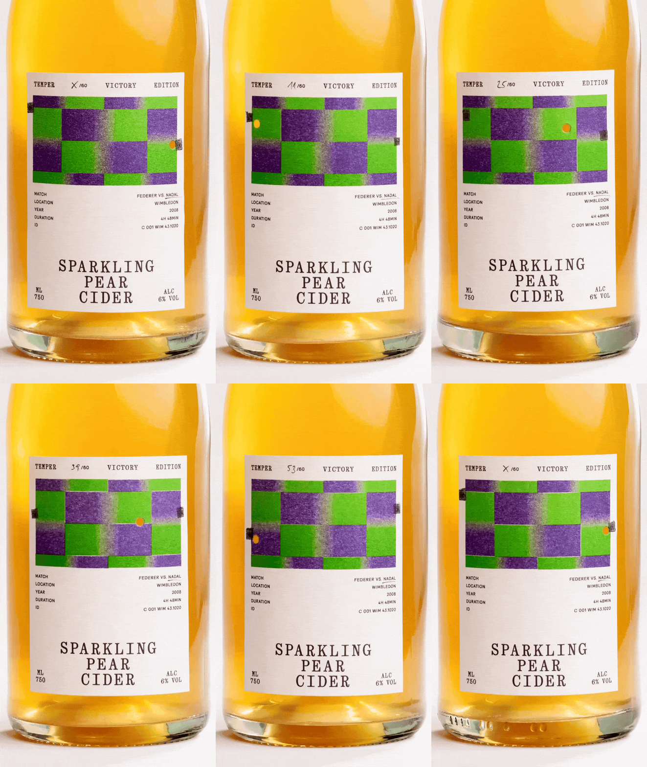
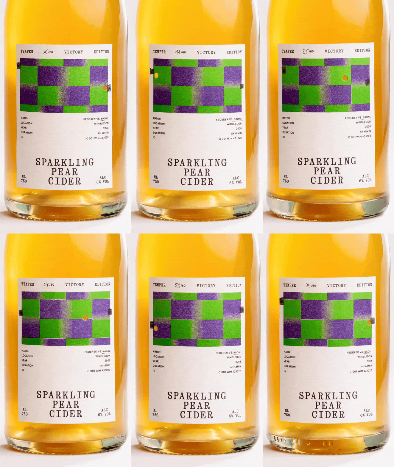
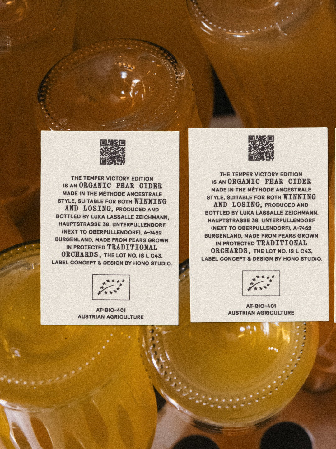
The one one-off collaboration between Temper – a studio for tennis objects and experiences – and cidermaker Luka Zeichmann is marked with labels that unfolds like a flip book when lined up.
Although Vienna-based studio Hono shapes brands, packaging design and communication across sectors, it has a particular affinity for food thanks to founder and creative director Sebastain Hofer-Nonveiller’s background in hospitality. Akin to sourcing good food and produce, Sebastian is interested in brands where “the product, the people making it and the way it reaches someone are closely connected,” he says. That’s why his studio model is intentionally small in scale too – “I develop most projects directly with the client and bring in photographers, printers, developers or illustrators when the idea calls for it,” he tells us. Those clients have often been close friends, since the studio only opened its doors last year, take Temper, for example.
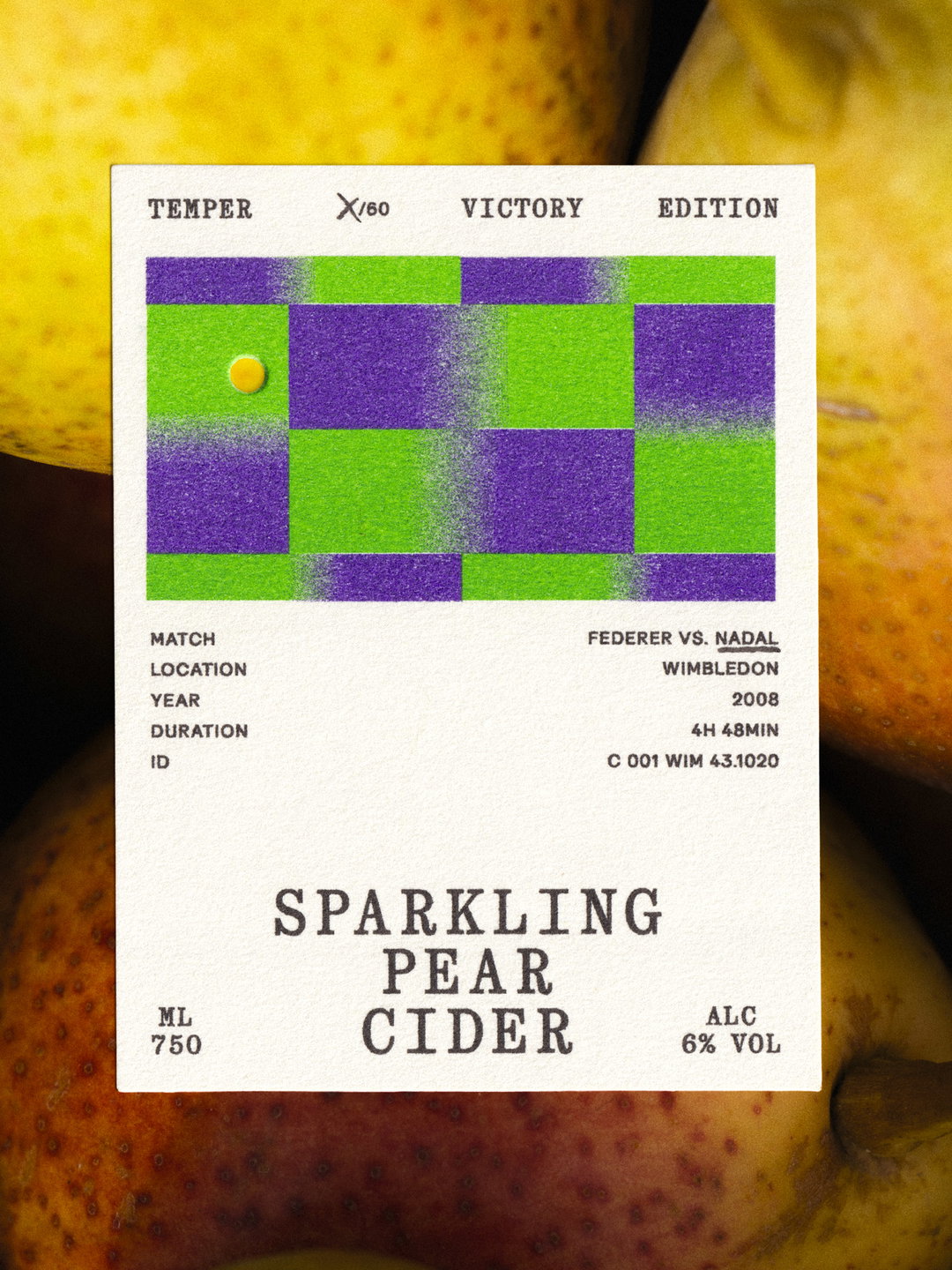
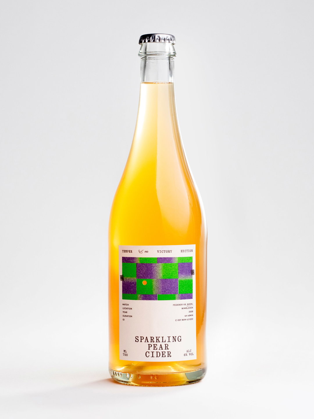
A studio for tennis objects and experiences, Temper is a sports brand that takes a more artistic approach than most, and its products tend to carry a story. So when it planned its UK launch in London during the first week of Wimbledon this summer, they wanted to bring something special along with them to share: “a cider that felt unmistakably Temper,” Sebastian says. Studio Hono’s starting point for the packaging brief was the tournament’s signature colours – the tennis court became their canvas for the bottles’ branding.
Studio Hono: Temper (Copyright © Sebastian Flek & Manuel Perić, 2026)
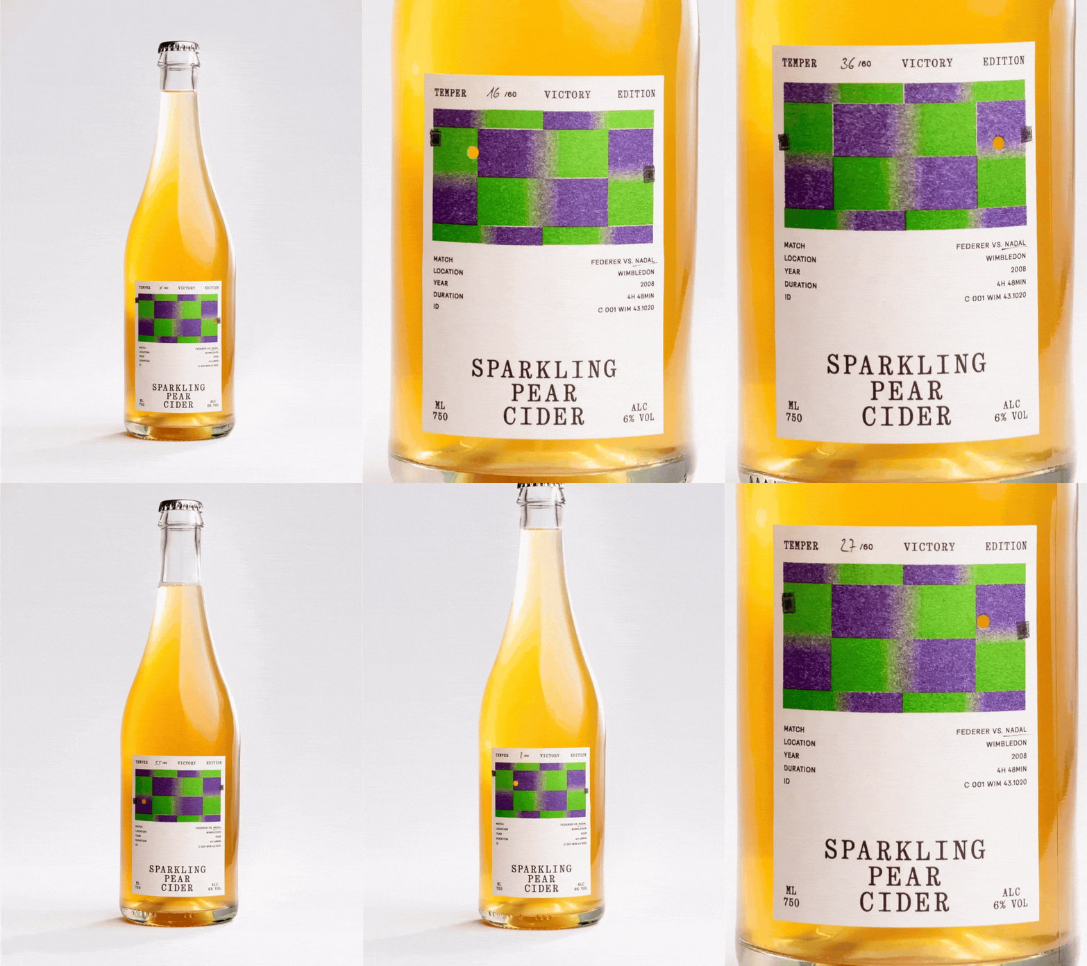
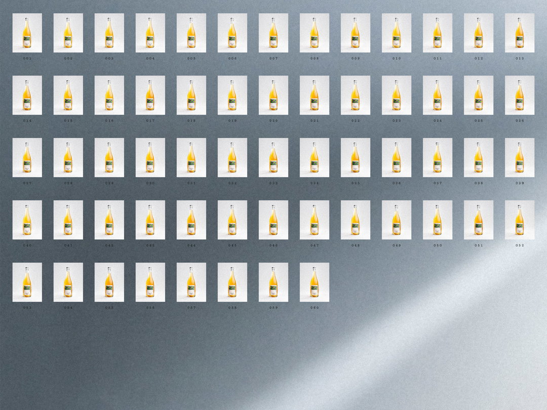
During a discussion about legendary tennis games, Temper’s team mentioned the famously long 2008 Wimbledon final between Nadal and Federer. But rather than trying to visualise almost five full hours of tennis, Hono became fixated on the idea of graphically translating the match point for the ciders packaging, on a grid of green and purple. “We went for the moment the win was decided: the final four seconds, broken into 60 frames. One frame, one bottle,” Sebastian shares.
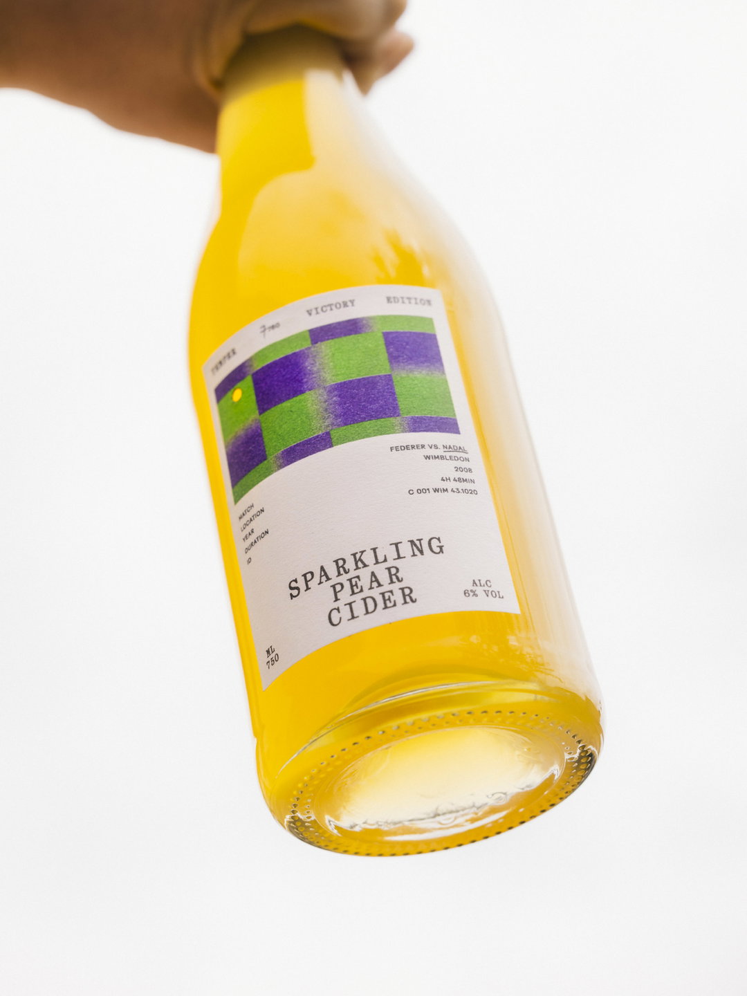
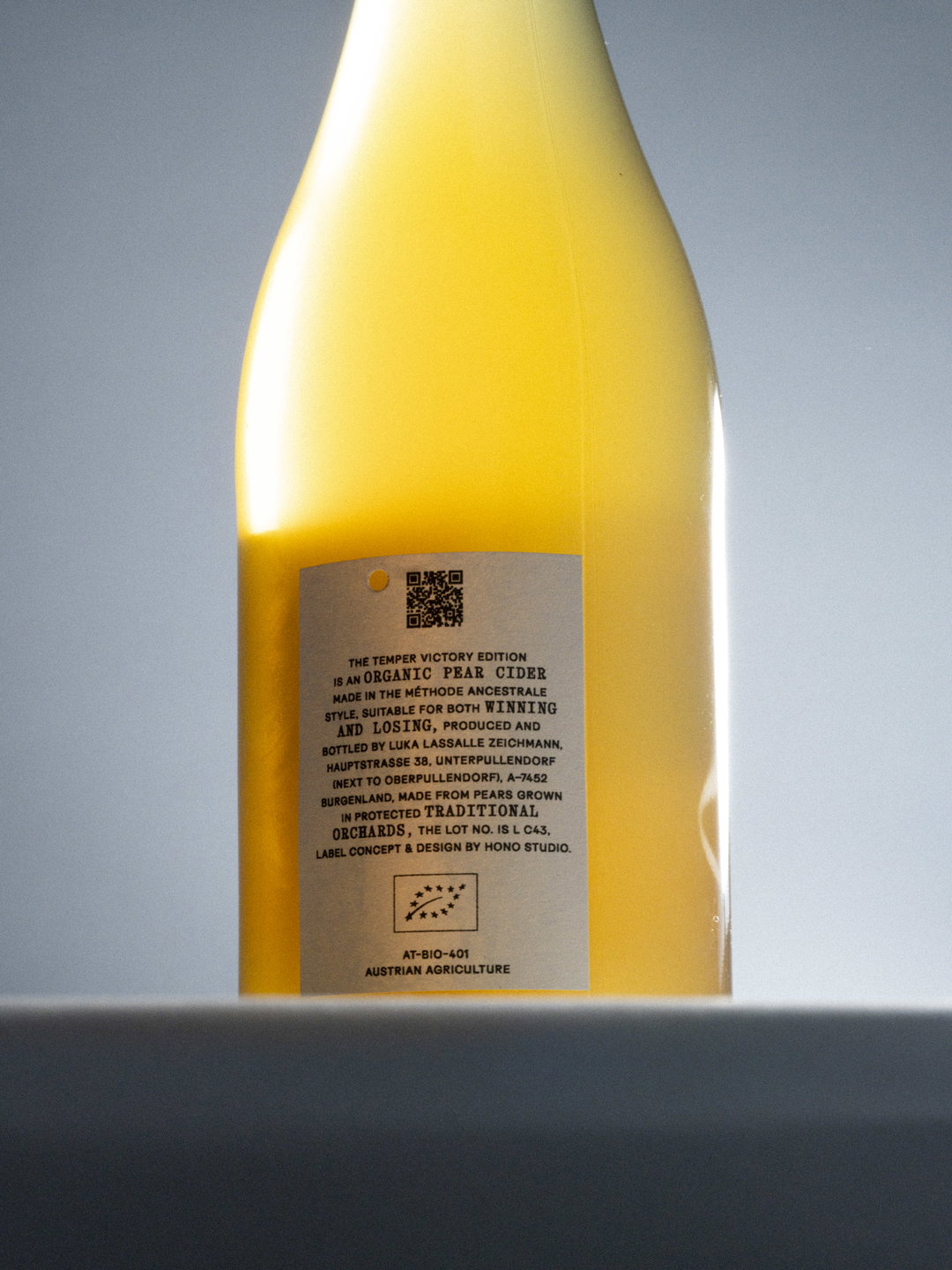
Once the studio had drawn up its 60 frames of action, they could have printed 60 perfectly rendered labels. “But that felt wrong for Temper,” Sebastian says. Instead, they collaborated with Risograph print studio Herr & Frau Rio in Munich who printed one base label design for all the bottles. Hono then finished and numbered each of these by hand: “The ball isn’t printed; it’s punched out, so when light comes through the bottle, the cider becomes the ball,” Sebastian explains. This hand-cut element wasn’t the only thing that created movement in the packaging’s design: “Riso is interesting precisely because it refuses to reproduce anything perfectly. Colours shift, registration moves, no two impressions are the same. When we digitised all 60 labels and animated them, those tiny printing differences started moving too.”
As is always the case with stop motion, each label only makes sense as part of the sequence, “so we couldn’t really see the result until all 60 were finished, scanned and played back on a screen. If a frame was off, we would only have found out at the very end, and fixing it would have meant going back to print and handwork,” Sebastian ends. “That made the moment we first pressed play quite tense. It took Nadal four seconds to win that point. It took us considerably longer to draw it.”
GalleryStudio Hono: Temper (Copyright © Sebastian Flek & Manuel Perić, 2026)
Hero Header
Studio Hono: Temper (Copyright © Sebastian Flek & Manuel Perić, 2026)
Share Article
Further Info
About the Author
—
Ellis Tree (she/her) is a staff writer at It’s Nice That. She joined as a junior writer in April 2024 after graduating from Kingston School of Art with a degree in Graphic Design. Across her research, writing and visual work she has a particular interest in printmaking, self-publishing and expanded approaches to photography. ert@itsnicethat.com
To submit your work to be featured on the site, see our Submissions Guide.