Masashi Murakami applies digital effects to physical objects
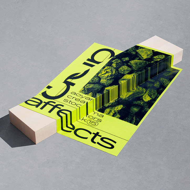
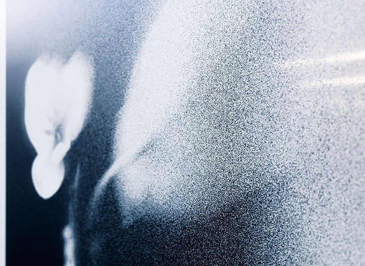
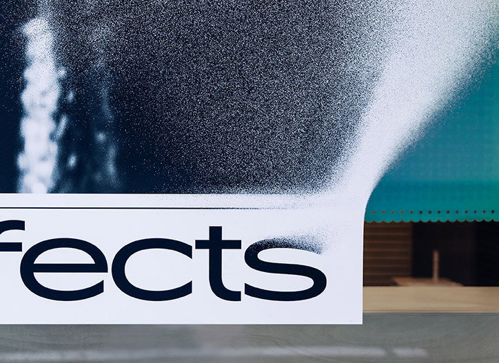
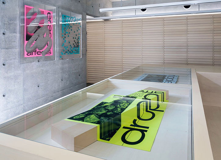
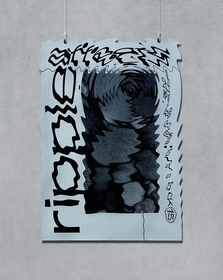
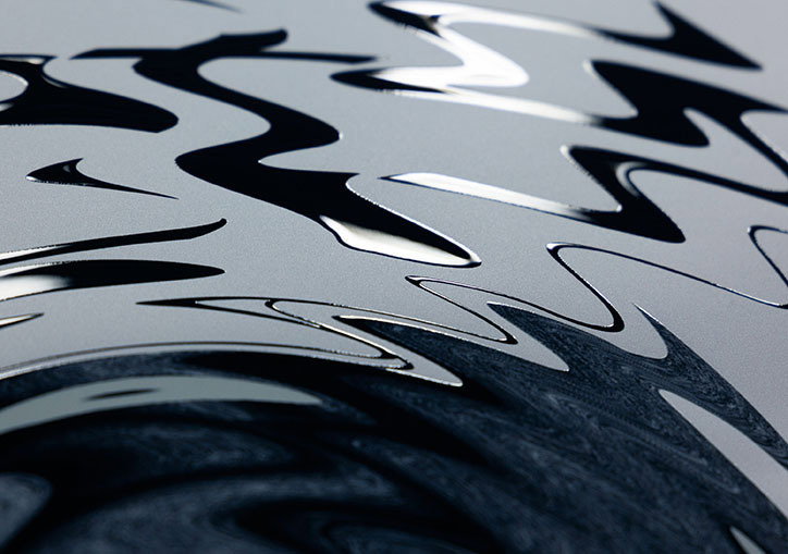
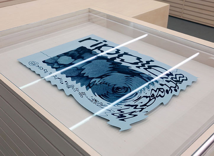
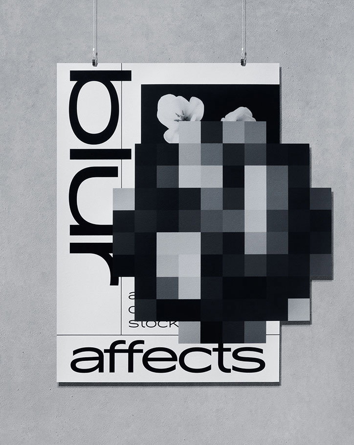
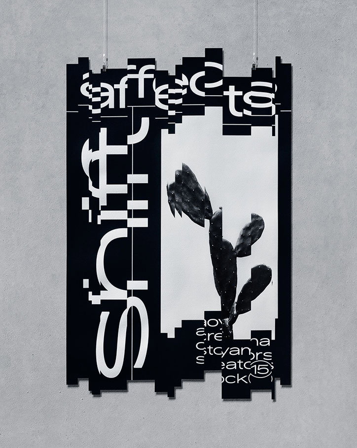
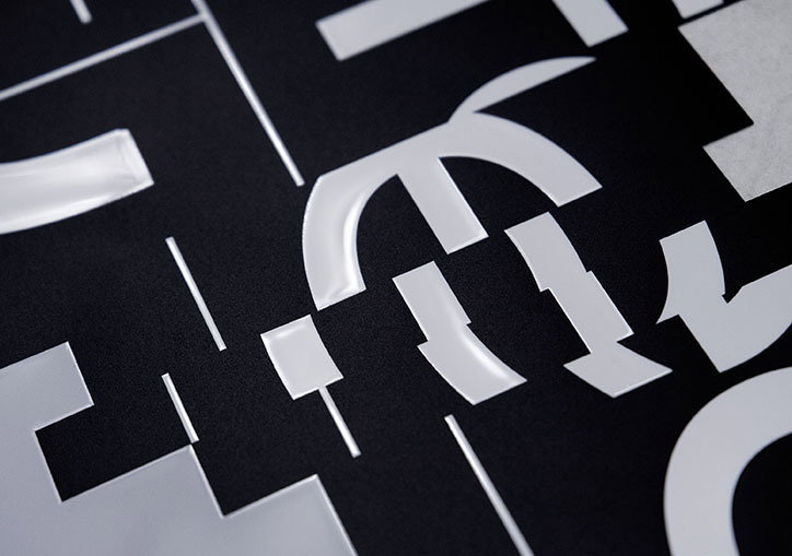
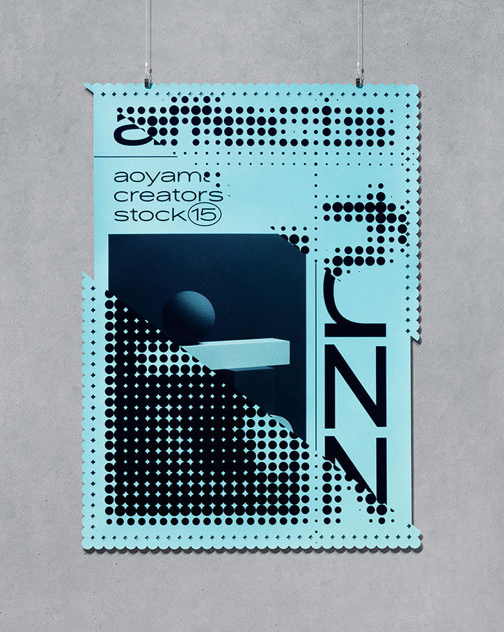
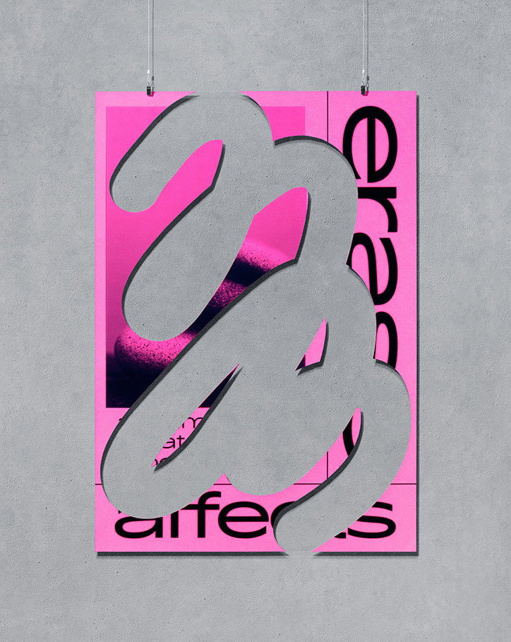
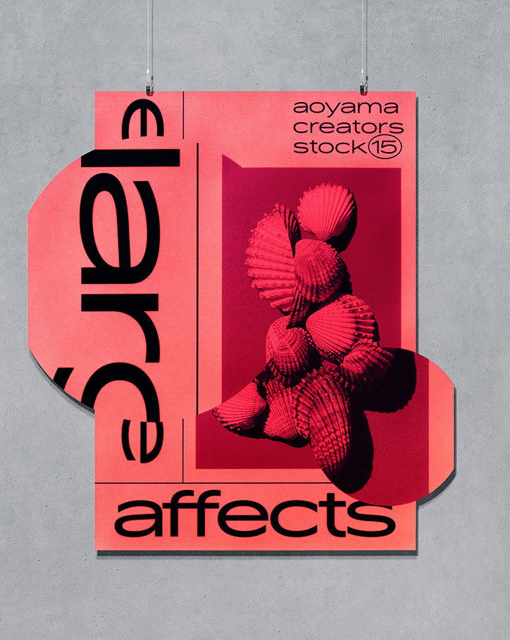
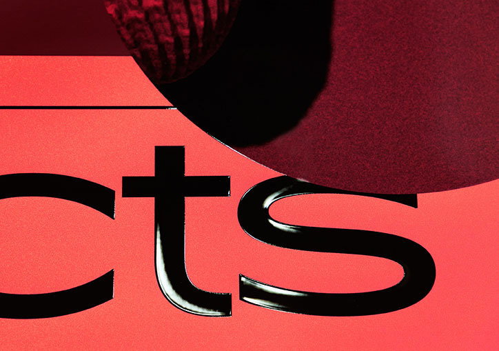
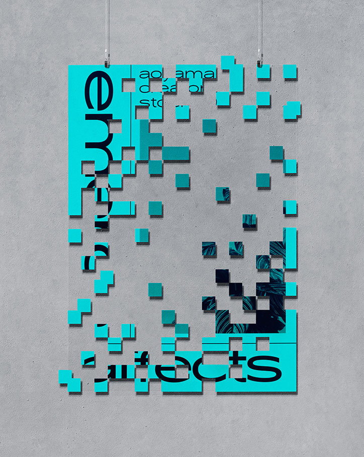
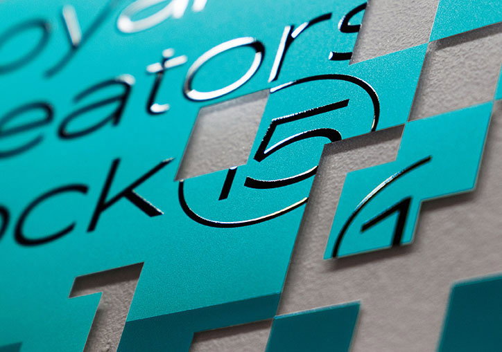
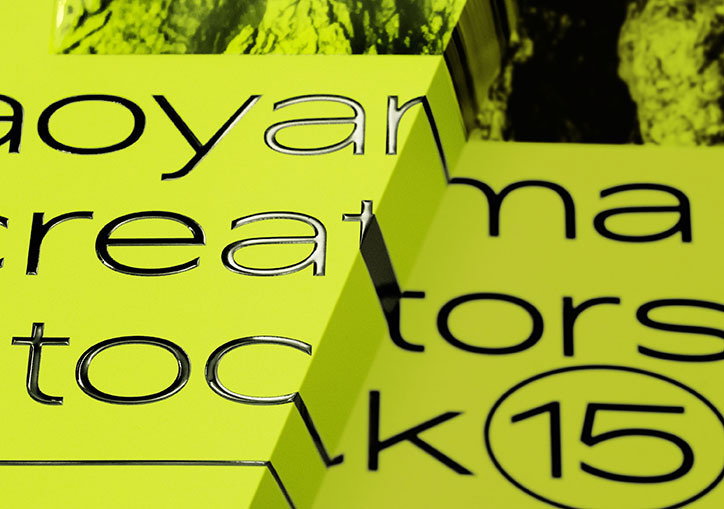
The Tokyo-based graphic designer’s affects series uses analogue methods to create digital-style changes to physical posters.
Share
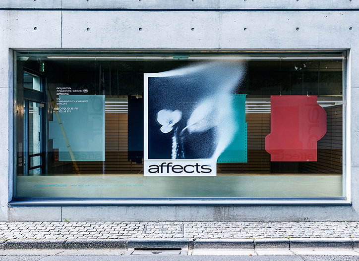
In an increasingly technological world, there is ever-more demand to make something digital appear physical – apps that “turn” iPhone photographs into 35mm film are a prime example of this. Rarely do we find ourselves changing things in the opposite direction, but that is exactly what Masashi Murakami has been exploring in his latest exhibition, affects.
“Due to the advance of technology, physical properties that could only be realised by actually existing can now be reproduced using digital arithmetic processing. However, the physical properties of virtual reality that are created by machine processing are nothing more than fiction and do not have any unexpectedness or attraction,” he tells It’s Nice That.
“I produced these pieces based on my belief that commonly seen digital expressions can have a completely new expression,” he explains. “It can tug at people’s heartstrings if I take the opposite approach of using analogue methods to give digital themes physical properties, rather than using digital methods to create analogue expressions, which is commonly seen today.”
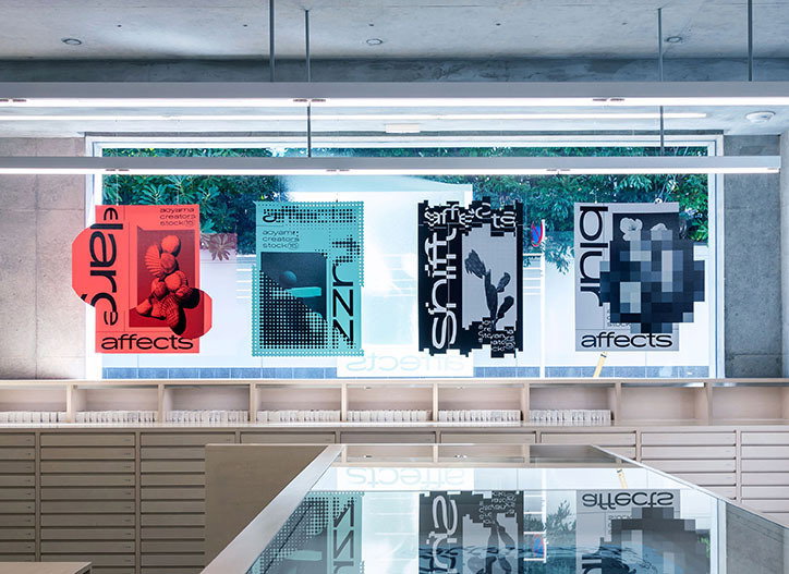
On first glance you can be forgiven for thinking that the project is made up of digital images, it is only when you look closer that you notice each distortion and effect has been physically implemented. Moving these usually digital techniques into a new sphere was an important component for Masashi, removing the constraints of language that he feels can divide design between Europe, America and Asia. “I wanted to create pieces that can go beyond the walls of graphic design, under the hypothesis that it would be possible to transcend language by freeing characters from their meaning and reinterpreting them as shapes,” he says.
Masashi Murakami: affects
A fascination for design has always been part of Masashi’s life, something instilled in him from a young age by his father, who was an in-house designer at a watch company. After graduating in graphic design from Tokyo University of the Arts, Masashi swiftly decided that working for a large corporation was not for him, choosing instead to learn his trade in smaller studios prior to going independent. In 2012, alongside his brother Takashi, he took the jump and created emuni studio in Tokyo.
Working across a range of briefs he finds the commercial work he does rewarding, but reiterates the importance of finding time for projects of your own. “Although creating pieces that serve the commercial purposes of the client are very interesting in certain ways, continuing to create these pieces leads to exhaustion and feeling like an empty shell,” he says.
To keep his mind fresh he travels frequently, and it was whilst in San Francisco that he found inspiration for affects, which has gone on to be exhibited at Takeo Co Ltd in Tokyo. “I was inspired by the cityscape, where the cultural sphere can change in an instant just by turning onto a different street. As I walked through I came up with the tessellated design, and that was the start of this project – I started production as soon as I returned to Japan.”
According to Masashi, graphic design in Japan is not what it once was, and he hopes that by breaking the shackles in this project it may go some way to help to address this. “Unfortunately, the design industry in Japan suffers from a village mentality and ridicule, which has given me the acute realisation over the last few years that it is an insular field where new ideas are not produced,” he says. “Through this project, I hope to be able to break preconceptions that posters must be flat and must be hung on walls, and ultimately create a stir in a stiff industry where there is no progress.”
GalleryMasashi Murakami: affects
Hero Header
Masashi Murakami: affects
Share Article
Further Info
About the Author
—
Charlie joined It’s Nice That as an editorial assistant in December 2019. He has previously worked at Monocle 24, and The Times following an MA in International Journalism at City University. If you have any ideas for stories and work to be featured then get in touch.