Artist and illustrator Karan Singh's hypercolour creations
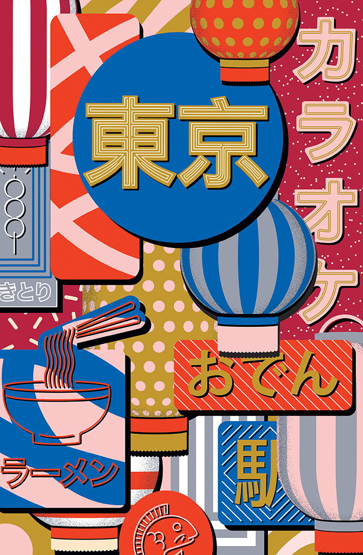
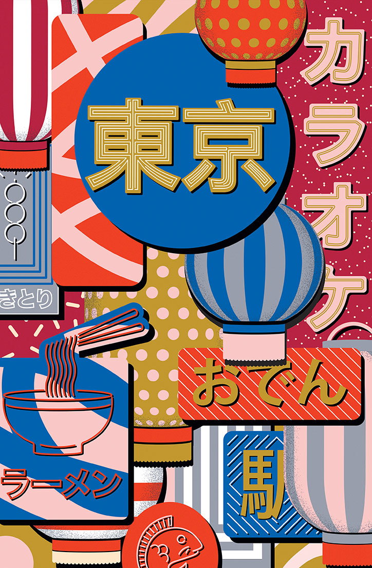
Artist and illustrator Karan Singh has been keeping busy since we last featured his brilliantly eye-catching work on the site back in 2014. Whether he’s making visuals to announce the launch of Nike’s latest trainers or travel posters for Airbnb, Karan’s distinctive work is always packed full of patterns. We caught up with the Tokyo-based illustrator to find out how life has changed over the past three years.
Hi Karan! So what have you’ve been up to since we last featured your work on the site?
Since we last spoke, I returned to full-time freelance, moved to Tokyo, had my first solo exhibition, launched a typeface and made a whole bunch of new work.
What have you learned since going freelance?
After returning to full time freelance in 2015, I had a lot more time to learn and to play. Experimenting with new mediums helped me push my skillset further but more importantly helped me broaden my approach about my work and what it could be. It also helped me break down a lot of constraints – most of which I had imposed on myself about what an illustrator should be and what they should make. Each new medium has allowed my aesthetic to evolve in a different way, but perhaps what is most enjoyable is that I don’t feel restricted to any one medium.
Since that big move to Tokyo, has the city influenced your work?
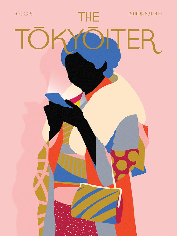
Of everywhere I’ve lived, I’ve learnt the most about myself in Tokyo. Prior to moving over from New York, I knew it was going to be really challenging, but in a sadistic way, that was why I decided to do it. Perhaps the most influential elements of Japanese culture that inspired me are simplicity through restraint. It’s hard to know when to put the pen down sometimes, so I’m constantly in awe at how flawlessly this is achieved through a few elements whether in art, fashion or cuisine.
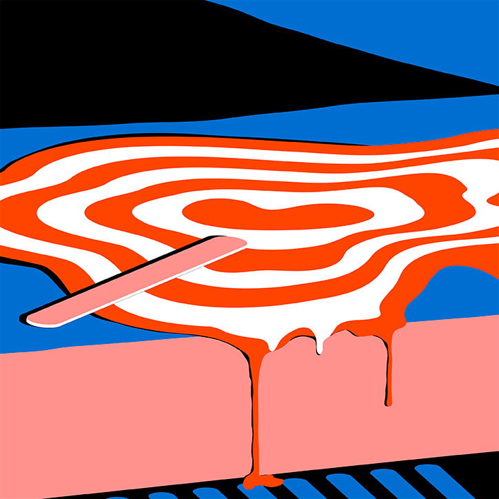
Karan Singh
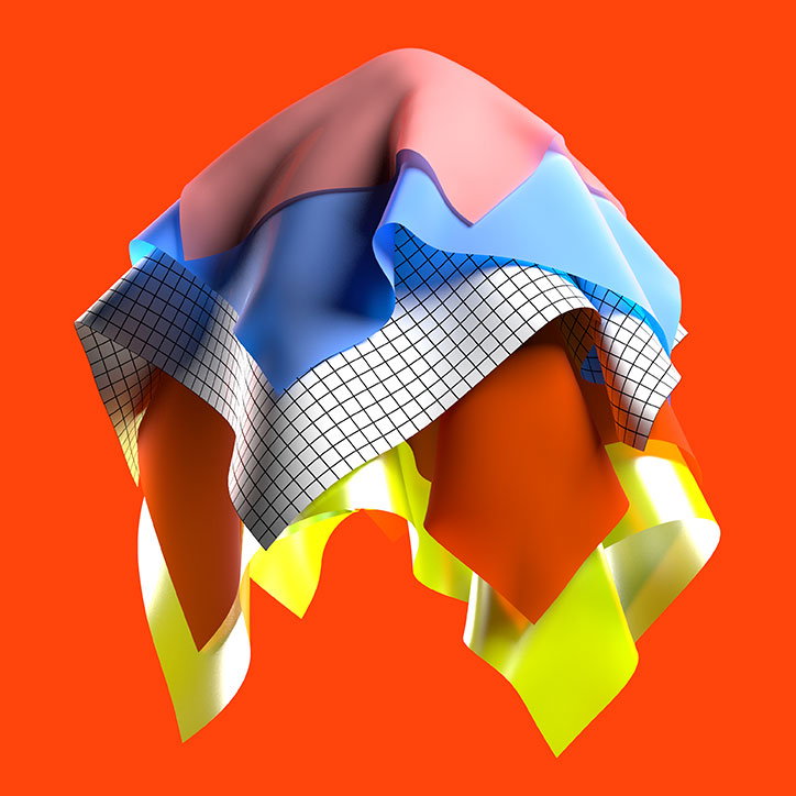
Karan Singh
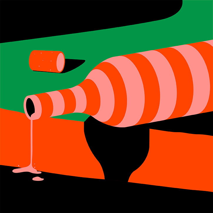
Karan Singh
Japanese culture aside, who or what inspires your work?
While I love to travel, I kind of love what I do even more, which leads me to be quite the homebody. Conversely my long-suffering girlfriend is probably the most adventurous person I know, and drags me away from the computer often — and I’m always grateful and better off for it. Getting away from my computer and being amongst the world whether it’s at a packed crossing or on a hike often leads to more ideas because I’m surrounded by sensory stimulus.
What’s been your favourite project during the last few months? Tell us about it.
I collaborated with an Australian music festival called Sugar Mountain where I designed an Augmented Reality stage. The learning curve was really steep as neither the festival, nor the AR company or myself had done anything like it before. Some things worked and some could have been better, but regardless, it was special because it meant learning something new and trying something that hadn’t necessarily been done on such a large scale in a new medium. It was also really positive to see so many people interact with space in such a unique way. Since then, I’ve been working on a series of AR projects and it’s been great to put these new skills into use.
What is it about patterns that continues to draw you in?
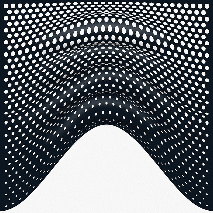
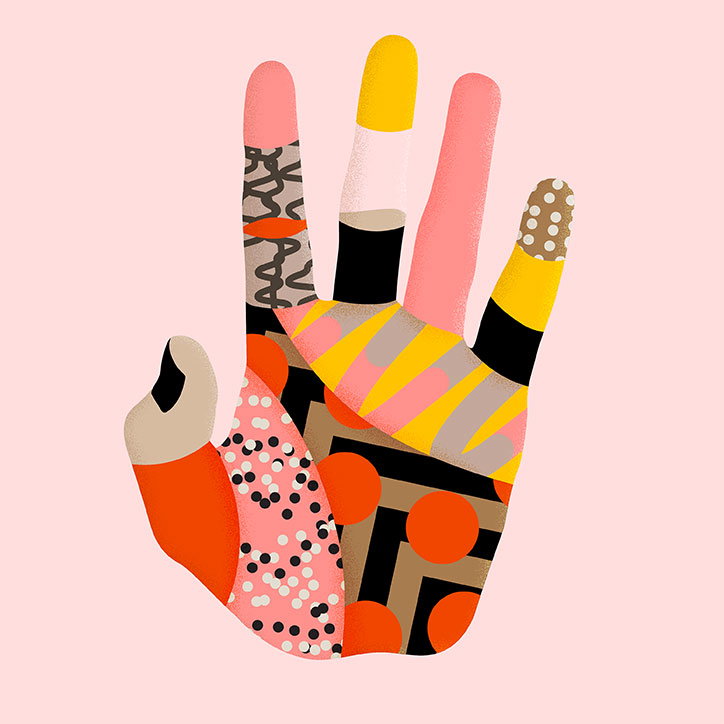
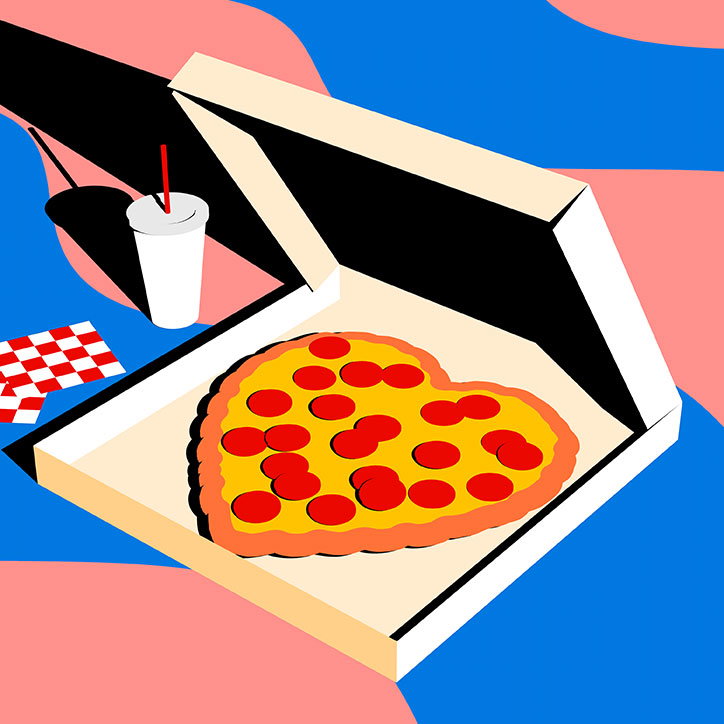
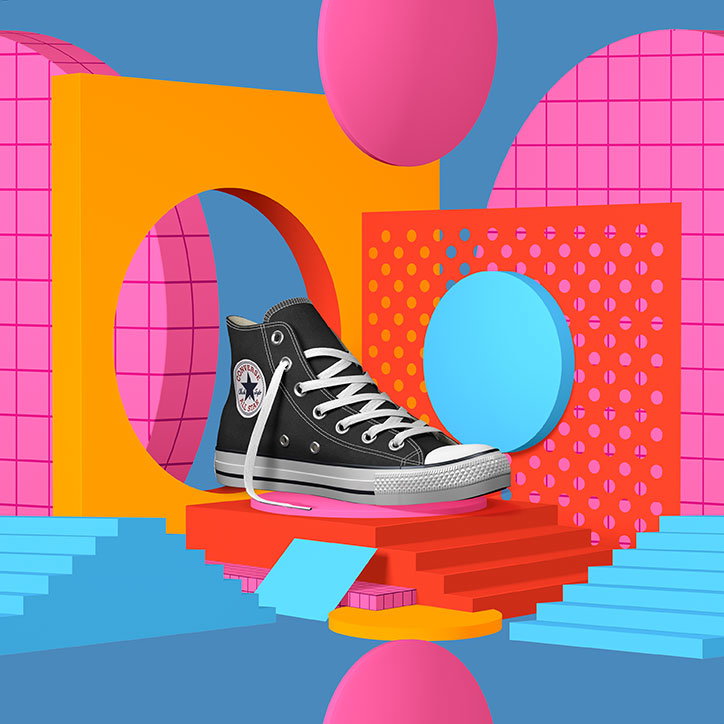
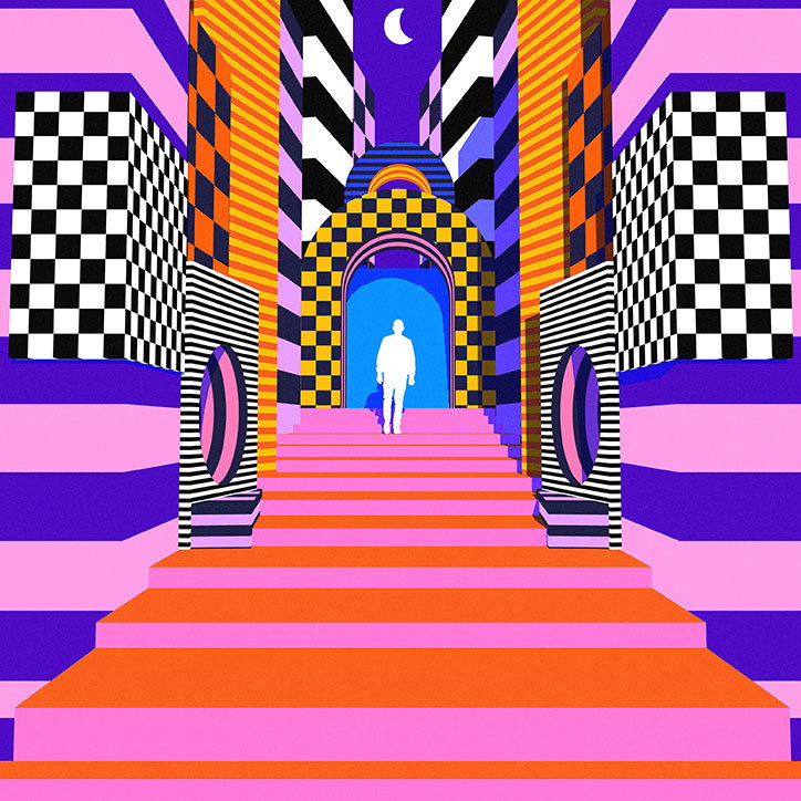
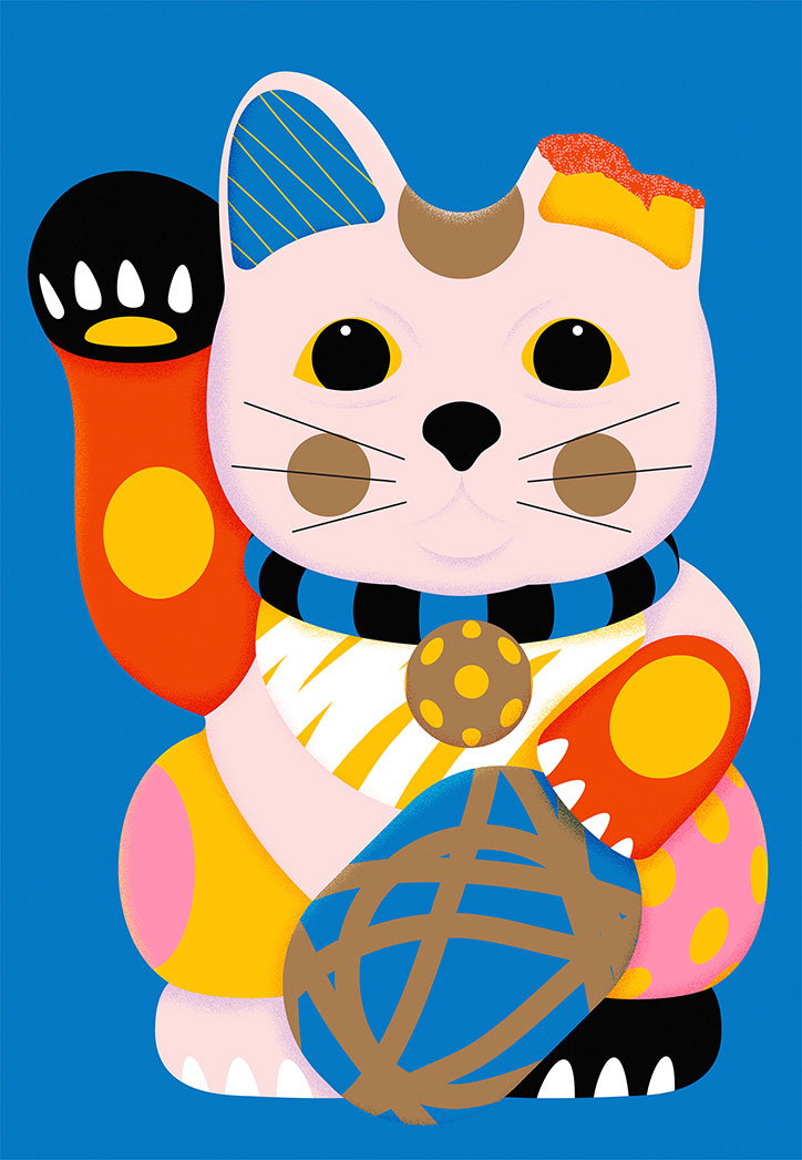
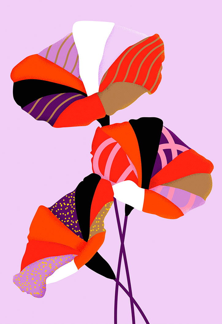
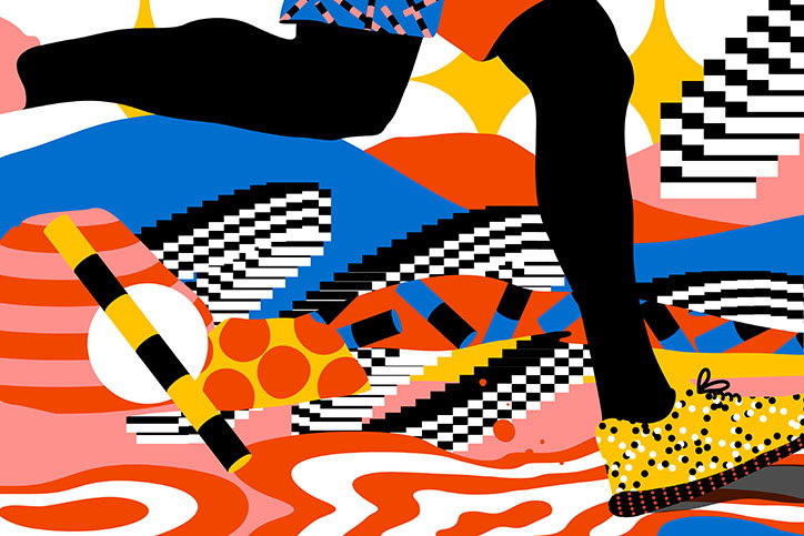
I have a short attention span and thus a tendency to need to evolve my work whether it’s tinkering with a style or learn a new medium. Initially, my love of patterns came from a desire to strip my work back to a bolder simpler approach. I explored how I could use them to convey dimension in a minimal way but this evolved over the years as I began to realise that patterns are everywhere. Where some artists might have a character they consistently use, I see pattern as the protagonist of my work, and it’s what gives me the confidence to experiment with multiple mediums, whilst feeling like they all belong to the same story.
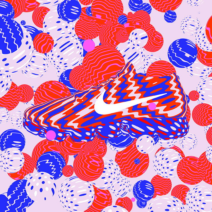
Karan Singh
Karan Singh
Karan Singh
Karan Singh
Karan Singh
Karan Singh
Karan Singh
Karan Singh
Karan Singh
Karan Singh
Share Article
Further Info
About the Author
—
Bryony joined It's Nice That as Deputy Editor in August 2016, following roles at Mother, Secret Cinema, LAW, Rollacoaster and Wonderland. She later became Acting Editor at It's Nice That, before leaving in late 2018.