The identity for the New York Times’ staff conference balances motion and legibility
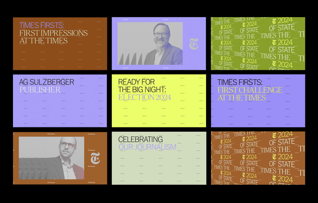
The branding for the State of the Times event, created by CC Studio in London, aims to celebrate the breadth of content and media that the newspaper produces.
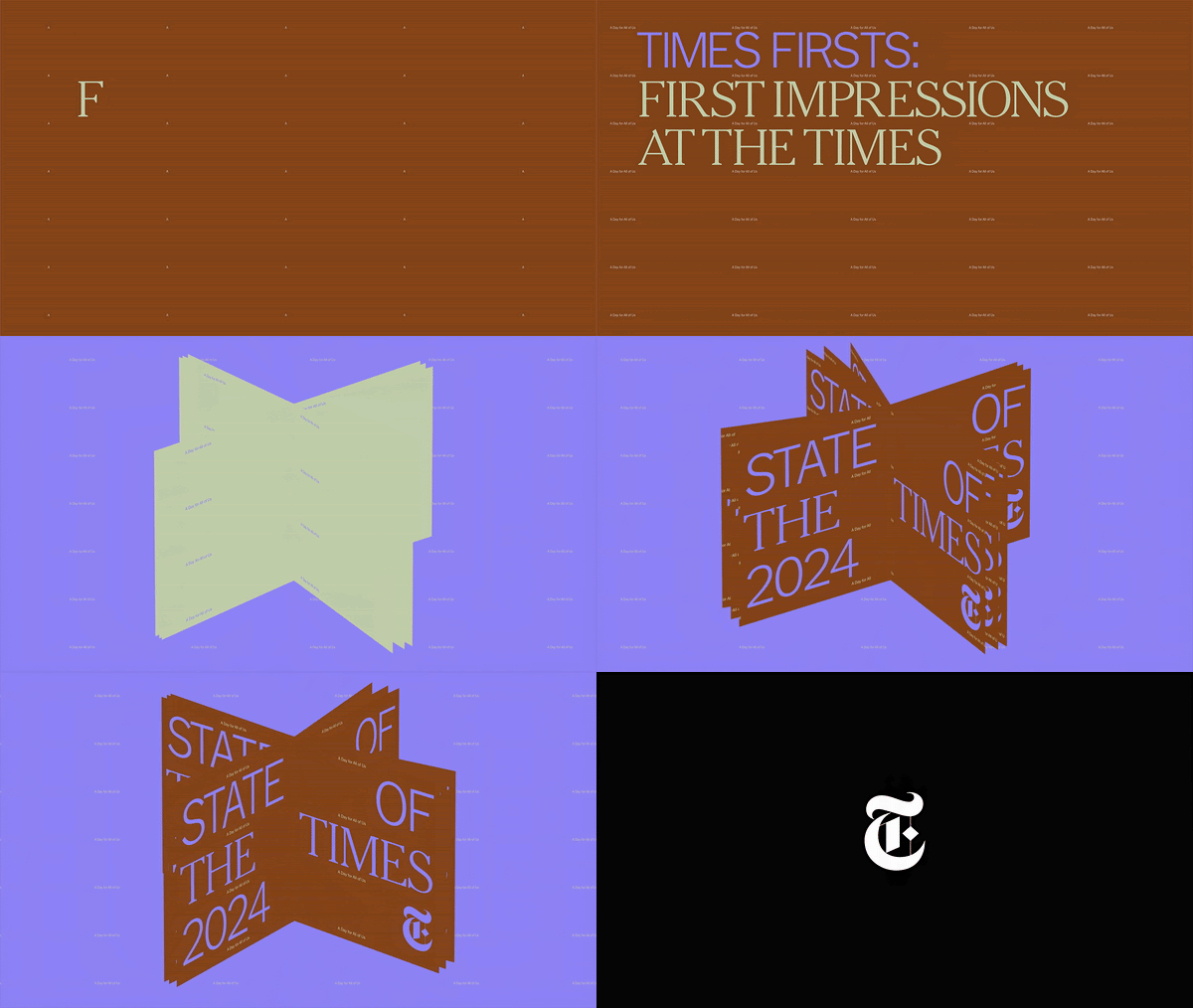
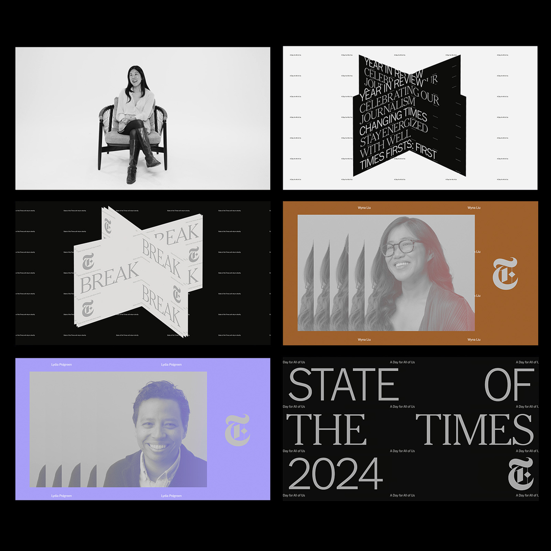
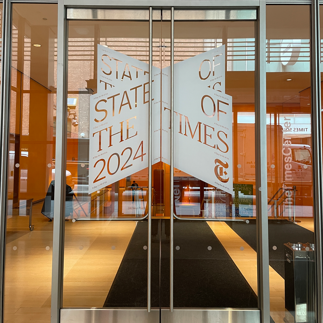
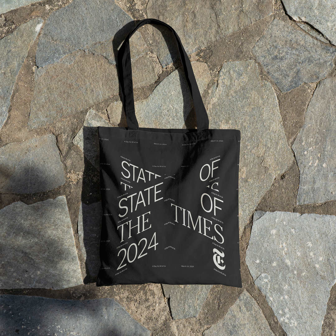
CC Studio has delivered an identity and motion system for The New York Times’ annual one-day employees’ conference, State of the Times. The design is multifunctional, incorporating both static and animated visuals. The static visuals largely served as a way to build momentum for the event through promotional posters; as visuals on screens at global viewing parties across its bureaux; on its newly designed intranet; signposting and presentation visuals throughout the Times Center (the newspaper’s 378-seat auditorium), including on its cafeteria screens and adorning its doors upon entry. The motion graphics were rolled out on the day of the event, acting as a cohesive system, playing before, after and during panels.
The project started as the result of a conceptually driven deck, passed on by the newspaper’s creative director of culture and communications, Jessi Brattengeier, including proprietary typefaces by Matthew Carter. “The brief could be summarised with a single phrase: ‘the bundle’,” Ewan Leslie, motion designer at CC Studio, says, “inviting us to celebrate the breadth of content and media streams that NYT operates within”. When starting out, the team encountered the challenge of summarising its vastness, which inspired this feeling of endlessness in the identity. Alongside a richness in colour used throughout, heavily inspired by the hyper-saturation of films by Wong Kar Wei that highlights the conference as both a tradition and a space for forward thinking. “We wanted the colourful animations to contrast with the black-and-white culture videos featuring interviews with our employees,” Jessi tells us.

CC Studio: Signs of the Times, The New York Times (Copyright © The New York Times, 2024)
One of the standout features of the identity is the ‘X’ isometric graphic. Created with the goal of celebrating the newspaper’s presence across a plethora of physical and digital platforms, it serves as a nod to history through its resemblance to the process of flicking through a book or magazine. “The refined ‘X’ hints at the open book whilst forming an expressive yet functional form,” says Ewan. “We used a repetitive typographic structure to reinforce the core concept of the bundle, which, when used in motion, enables the transition between content.” In the other motion graphics, the bundle concept was again reinforced. It uses repeated typography, elements of constant motion, stacked imagery, as well as three-dimensional perspectives where the imagery and text run off the screen, creating an illusion of continuing forever. “In contrast, we created a refined treatment for the key titles, noting the importance of striking a balance between communication and legibility,” he adds.
As the assets were used for different purposes and in multiple locations, the creation of each included a variety of approaches. For instance, the studio wanted the broader identity animation to offer a snappier overview of the identity, relying less on the functionality in comparison to the speaker walk-on animations. “It was important for the talk title and speaker names to be legible, and for the secondary animations played throughout breaks and on promotional screens around the venue to use a more gentle constant motion,” says Ewan.
On the typography side, the team needed to operate with the already established visual language of the newspaper. “We wanted to give the identity a contemporary edge by subverting the hierarchy of the NYT, using NYT Franklin alongside NYT Cheltenham in equal size and weight,” he says. “We played with the scale and used a significantly lighter weight of the type to create a balance between elegance and legibility which, when using the brand typefaces, still feel recognisable.”
GalleryCC Studio: Signs of the Times, The New York Times (Copyright © The New York Times, 2024)


Hero Header
CC Studio: Signs of the Times, The New York Times (Copyright © The New York Times, 2024)
Share Article
Further Info
About the Author
—
Yaya (they/them) was previously a staff writer at It’s Nice That. With a particular interest in Black visual culture, they have previously written for publications such as WePresent, alongside work as a researcher and facilitator for Barbican and Dulwich Picture Gallery.