Graphic Design: French studio A is a name are bastions of excellent simplicity
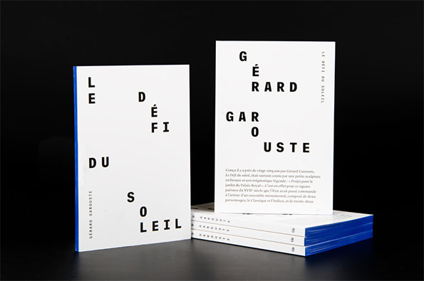
A = everything. This is the simple equation and motto set out by Parisien graphic designers A is a name. As the only capital in their name the ‘A’ stands for typographic form. It represents their attention given to typography, believing that everything in graphic design comes back to this. A is an icon.
And their work stays true to this; paying unrelenting attention to composition, words sit boldly upon the page, complementing the strength of the images they are often coupled with. Their 2011 spread for Dazed & Confused reflects this perfectly. Alongside Christopher Simmonds, who worked on the type composition for the spread using a font drawn by the studio, the strong angular eyebrows match with powerful lettering, and a magnificently striped couture dress is mirrored by aligned words.
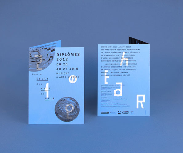
A is a name: HEAR Graduation Show
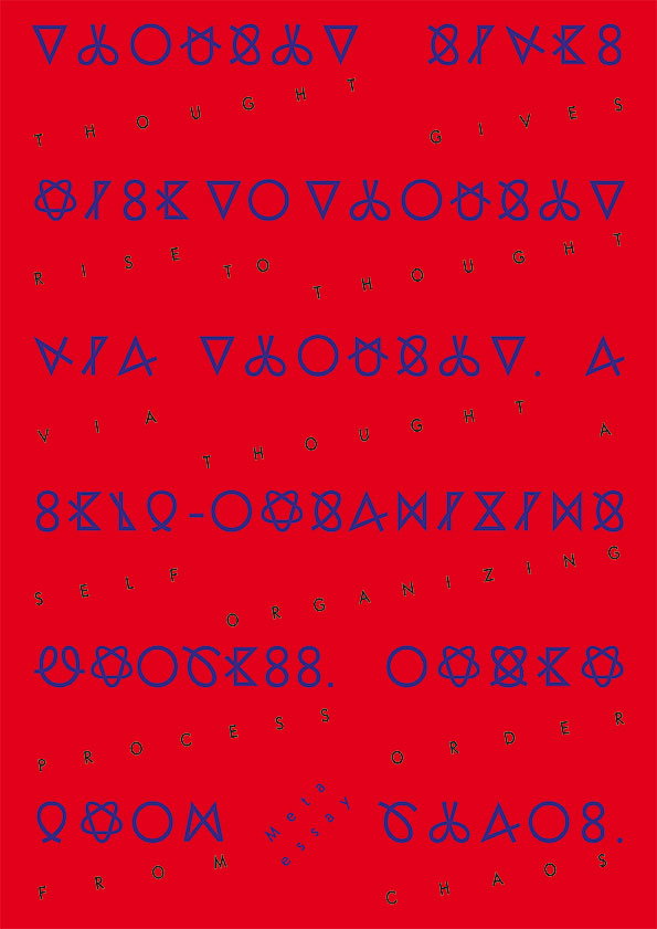
A is a name: Self Organizing Process
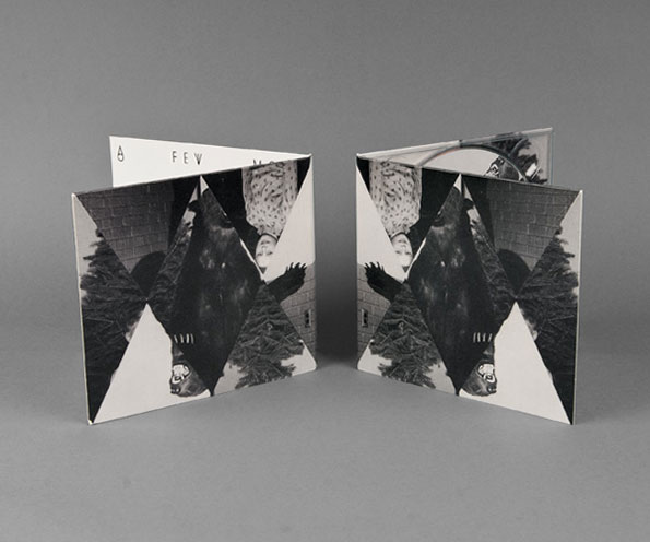
A is a name: A few more things from Ivan Smagghe (and Friends)
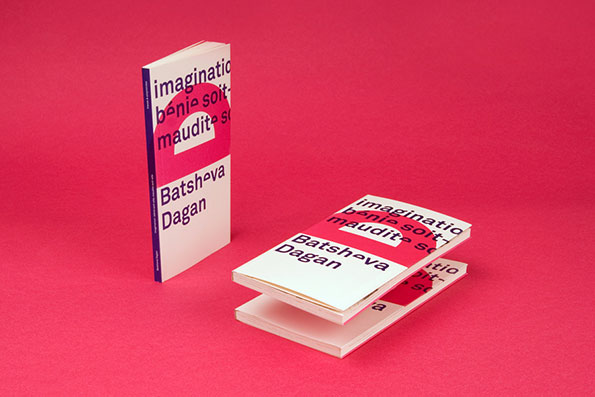
A is a name: Imagination- Batsheva Dagan
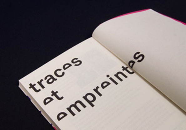
A is a name: Traces et Empreintes Publisher
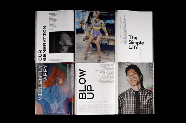
A is a name: Dazed & Confused
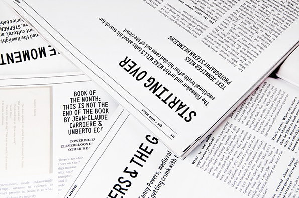
A is a name: Dazed & Confused
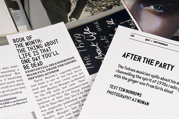
A is a name: Dazed & Confused
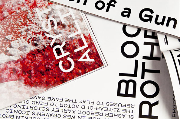
A is a name: Dazed & Confused